Related Topics

The first eight tool icons Form Controls toolbar displays the most commonly-used controls for the Online Form Designer. The Journal control was added to this toolbar in v6.1.003. Prior versions of the product display only the seven other tools.
 Input Control
Selecting this item places an Input box in the document where the cursor is located. The name of the Input control can be changed in the Properties dialog box.
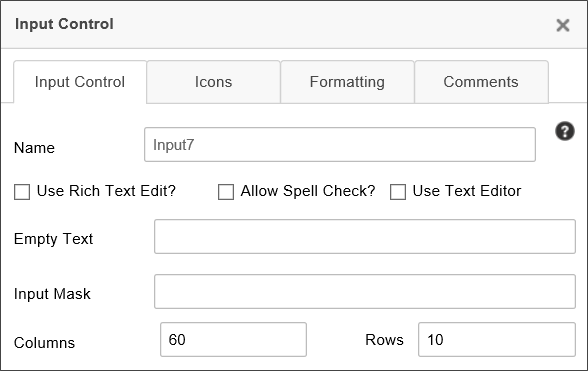
Set the Name to the name of the field you want to use on the Form. The fields name and description can be changed in the Input Control tab of the properties, while the formatting can be changed in what we conveniently call the Formatting tab of the properties.
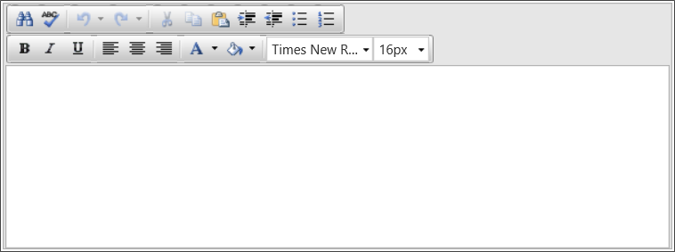
The input control's default display mode is plain text; however, by checking the Use Rich Text? check box, the field will display as a Rich Text field, and allow basic formatting via a simple rich text editor. Additionally, pasting formatted text will carry their formatting over into the Rich Text box, including HTML formatting. (any JavaScript in pasted HTML will be stripped.)
The Allow Spell Check property turns on the browser's integrated spell checking for the contents of the Input box.
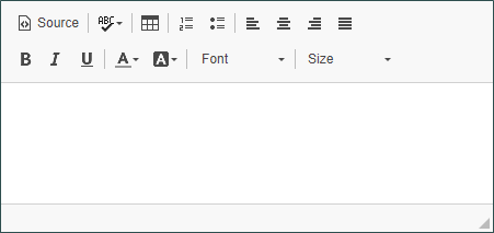
The Use Text Editor property enables a more modern text editor than the legacy Rich Text editor.
The Empty Text property enables you to enter the text you'd like to display in the input control when it is empty. This is useful for displaying brief instructions for the field.
The Input Mask property enables you to specify an input mask that will appear to users when they fill out the form. Input masks can be constructed using the following syntax.
|
MASK CHARACTER |
DESCRIPTION |
|---|---|
#
|
Digit or space (optional). If this position is blank in the mask, it is rendered as a prompt character. |
L
|
Uppercase letter (required). Restricts input to the ASCII letters A-Z. |
l
|
Lowercase letter (required). Restricts input to the ASCII letters a-z. |
a
|
Accepts any character. If this position is blank in the mask, it is rendered as a prompt character. |
By way of example, you can, using the above mask characters, set up an input mask for a phone number, using the syntax:
(###) ###-####
At run-time, the user will see the input mask:
(___) ___-____
Input masks can't be used if the Rich Text checkbox is checked, and the Input Mask property will be disabled.
The Columns and Rows properties enable you to set the horizontal and vertical sizes, respectively, of the control.
For users of Process Director v4.5 and higher, input controls that implement numeric data types right-justify the text by default.
For users of v4.52 and higher,the AutoMultilineTextBoxResize Custom Variable enables resizing of multi-line Input controls.
Additionally, in conjunction with the AutoMultilineTextBoxResizeClass Custom Variable, you can also enable automatic resizing as you type, to automatically expand the text box as you type, to fit all of the text without needing to scroll through it. To enable the automatic resizing feature, you must go to the Formatting tab of the Input control, and set the CSS Class property to the class name specified in the AutoMultilineTextBoxResizeClass Custom Variable.
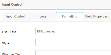
The default class name for this variable is named BPExpanding. Please refer to the Custom Variable topics linked above to see more detail about how to implement these features.
 Check Box
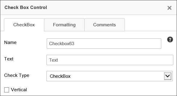
Selecting this item places a Checkbox control in the document where the cursor is located.

The name and settings of the Checkbox can be modified by right clicking on the field and selecting the Properties menu item. Set the Name to the name of the field you want to use on the Form.
|
OPTION |
VISUAL REPRESENTATION |
|---|---|
| Checkbox |

|
| iOS |

|
| Light |

|
| Flat |

|
| Skewed |

|
| Flip |

|
 Checkbox controls always have a value. They are either checked or unchecked. Configuring a Checkbox control as required will have no effect, since both checked and unchecked boxes have a valid value.
 Date Field
Selecting this item inserts a form control that will display a Date Picker control where the cursor is located.
When the date control is clicked on in the Form, a popup date picker is displayed making the selection of a date easy for the user. In the Properties for the control, you can configure whether the picker should be just a date picker, just a time picker, or a datetime picker.
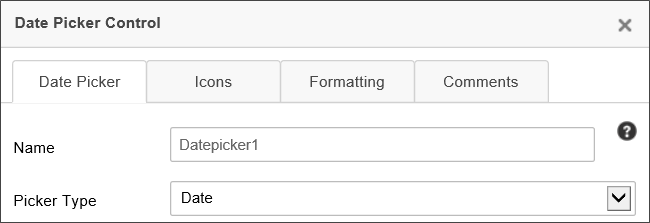
When setting the value of a Date Picker control using the Picker Type of "Date" programmatically (for example, using a Custom Task), any time information included will be discarded. To retain the time information, you must set the Picker Type property to "Date/Time".
While the Date Picker can be displayed as a Date/Time picker, the times shown are only displayed in hourly increments, and display all 24 hours in a day. The display of the UI control cannot be customized. To customize the time intervals and/or to specify the start and end times to display, you will have to use the DateTime control tag. The control tag enables you to display times in any desired increment of minutes, and to set the start times and end times for limiting the of times displayed to a desired time span.
In Process Director v6.1.500 and higher, the control's appearance at run-time was modernized by updating the control to use Telerik's Kendo UI.
 DropDown
Selecting this menu item places a Dropdown control where the cursor is located.
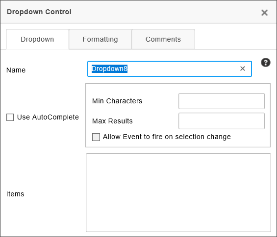
In addition to the standard Name property, the following properties are configurable.
The Use Auto Complete property, when checked, transforms the Dropdown control from a standard, selectable dropdown to a type-ahead dropdown. When you check this property, two additional properties become enabled. The first of these is the Min Characters property, which enables you to specify the number of characters a user must type before the type-ahead dropdown returns matching items. The higher the number, the fewer queries that will be required to return items that match the text you've typed. The second associated property is the Max Results property, which specifies the maximum number of matching items that will be returned in the type-ahead dropdown. Again, this enables you to minimize the number if items each query returns. Additionally, if you want the field to be an event field, you must check the Allow event to fire on selection change property, in addition to setting the field as an event field on the Form Controls tab of the form definition.
 To enable Type-Ahead to display properly, the EnableFormThemes Custom Variable must be set to "false".
For Process Director v5.31 and higher, dropdown Controls that use the TypeAhead feature with a Business Value will invoke a dynamic evaluation of that Business Value if one of the parameters matches the configured Event Control.
Setting the Items in the Dropdown List
You can fill the dropdown manually by typing list items in the Items property box, with one item for each row. When an item is selected in the dropdown list the text of the item will be stored in the form field on the server. If you choose to associate a value that is different than the text, it can be accomplished by adding a colon (“:”) followed by the desired value. For instance if you want the user to see "August" in the dropdown, but you want to save the month number, "8", in the database, add the following text to the Items property box:
August:8
The text to the Left of the colon will be displayed in the dropdown, while the text to the right of the colon will be saved as the value of the field in the database. Similarly, you can save a null value to the database using the colon followed by quotation marks, as demonstrated in the following example:
[Select One]:""
This method also enables you to set a dropdown as a required field, since the NULL value will automatically be considered by the system as having not been filled out, and will cause a validation error.
|
ITEM VALUE |
USER WILL SEE |
VALUE STORED IN DATABASE |
|---|---|---|
|
|
August |
August |
|
|
August |
8 |
[Select One]:""
|
[Select One] | NULL |
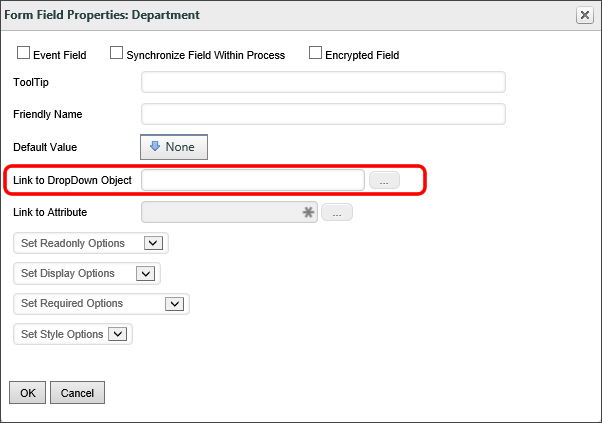
Instead of manually setting the list items for the dropdown using the Items property, you can assign a Dropdown Object to provide the values for the dropdown control. In the Form definition, in the field properties of the dropdown control, you can set the Link to Dropdown Object field to populate the dropdown control with the values in the selected Dropdown content object. See the section of this document entitled Dropdown List Content Object for more information.
You can fill the dropdown list from a database. You can either use the Fill Dropdowns tab of the Form definition to specify a Business Value to use to fill the dropdown list, which is our primary recommendation, or you can use one of the Fill Dropdown Custom Tasks.
Finally, you can use a Business Rule that returns a List of Users or a List of Groups to fill the dropdown.
 Irrespective of the manner you use to fill the options for the Dropdown control, the Best Practice is to ensure that a default blank option is set for the control. Otherwise, the control's value will default to the first item in the options list. In that case, setting the control as required will have no effect, as the control will ALWAYS have a valid value, and thus will always pass validation checks.
Other Configurations
To set the default value for the dropdown list, specify the value of the item in the Default Value field of the Form definition on the server (see the section named Form Definition Properties in this document for more information). Dropdowns (and related controls) will display all entries, even those with duplicate values. So, for example, if a dropdown populated with country names has two entries with the display strings "United States" and "USA", each with the value "US", both will be displayed. Using the "None" option in the System Variable Chooser dialog box to set a DropDown or Listbox control in the Form Definition's Set Form Data tab will now set the value of the control to an empty string.
To configure the dropdown field as a required field in the Form Properties, which will force the user to choose an item in the list, ensure the first entry contains a NULL value. Process Director won't save the form until the NULL value is replaced with a valid value.
 Radio Button List
 For Process Director v6.1.500, the Radio Button List replaces the Radio Button in the basic controls toolbar.
The control returns a single value from a list that is displayed as a series of radio buttons.
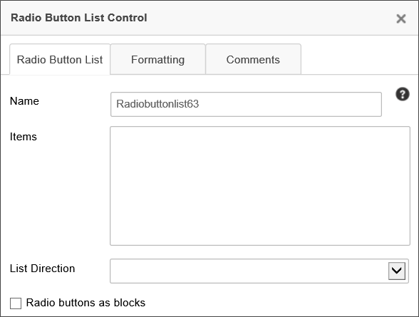
The Items property enables you to add items to the Radio Button List by placing one item in each line in the Items input box. Unlike the Radio Button control, which is static, the Radio Button List control is a type of list control, like a Dropdown or List Box, so items can also be added to a Radio Button List from a Dropdown Object or Business Value.
The List Direction property enables you to select whether you wish the radio buttons to be arrayed horizontally across the page, or vertically in a single column.
 Section
The Section control is the primary control used to organize similar controls together on a Form. Moreover, the need to conditionally show or hide controls makes Section controls especially useful. Sine this control enables you to group similar controls together, setting the visibility of a Section control essentially sets the visibility for all the child controls, since, if a Section is hidden, all of the child controls are hidden as well. It's a good idea to organize your form into Section controls that contain groups of controls that are relevant to the different portions of the process. As the process moves forward, you can then hide or show the relevant Section controls, based on any evaluable condition.
Sections with Titles will look like this in the edit mode of the Online Form Designer:

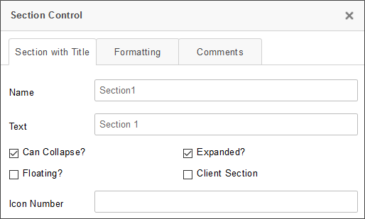
In the Section’s properties, you can edit the Name of the section, the Text of the section (which is visible to the user), whether the section can be collapsed or expanded, whether it is expanded by default or not, and the image URLs for the collapse / expand buttons.
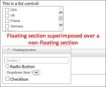
Checking the Floating? property will make the section, when expanded, display on top of other sections.
Expanding/Contracting Sections
In addition to the regular field settings for visibility or enabling the control, Sections can also expand or collapse. The Section control's Value property determines whether control is expanded or collapsed. Setting the value to "0" will expand the section, while setting the value to "1" will collapse the section. The default value is "0".
You can set the value in the Form control's at design time by either:
- Checking or unchecking the Expanded? property's check box in the Section control's Properties dialog box in the Online Form Designer, or
- Setting the Default Value property in for the Form field's Properties dialog box in the Form Controls tab of the Form Definition.
You can also set the value at run time by using the Set Form Data tab of the Form definition (the recommended method for most use cases) or using the Set Form Data Custom Task in the Custom Task Event Mapping Tab of the Form Definition to change the control's value, based on some condition you desire.
A section can also be displayed as Client Section by checking the property. Client sections can be expanded or collapsed without a postback to server occurring to show or hide the section. This may be useful for large forms with many sections that need to be expanded or collapsed at run-time by the end user. However, unlike a regular section, the all of the section data for the client section is delivered to the browser, so, even if the section is collapsed, all of the data in the section is discoverable by the end user.
 Switch
Selecting this menu item places a Switch control in the document where the cursor is located. The Switch control is similar to a Checkbox, in that it shows two states, but with a more modern appearance. Like a Checkbox, Switch controls always have a value, irrespective of their selected state, so setting a Switch as a required field has no effect.

The name and settings of the Switch can be modified by double-clicking on the field and modifying the settings in the Properties dialog box. Set the Name to the name of the field you want to use on the Form.
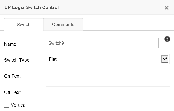
The On Text property enables you to specify the text that the switch will display when the switch is selected, using the Skewed or Flip Switch Type.
The Off Text property enables you to specify the text that the switch will display when the switch isn't selected, using the Skewed or Flip Switch Type.
The Switch Type property enables you to specify the type of control you'd like to use to represent the check box. You can set the visual appearance of the check box as one of the following options:
|
OPTION |
VISUAL REPRESENTATION |
|---|---|
| iOS |

|
| Light |

|
| Flat |

|
| Skewed |

|
| Flip |

|
The default appearance for a switch is an appearance similar to the switches used in iOS.
If the Vertical property is selected, the iOS, Light, and Flat Switch Type will display as a vertical, rather than a horizontal, Switch.
 Journal
 For Process Director v6.1.003, the Journal control was added to the basic controls toolbar.
The Journal control enables you to display threaded comments from users. This control should replace the CommentLog control on most forms, and provides a better view of user comments, because comment threading is built into the control, unlike the Comment Log.
In addition to serving as a comment log, the Journal control has the equally important feature of being able to display all Milestones configured in the Milestones tab of the Timeline, Form, and Folder Definitions. Milestones drive collaboration through the Journal control, because the Journal provides a semantic history of cases, processes, and more, which are derived from the Milestones that occur.
For more information about Milestone events, see the Milestones topic.
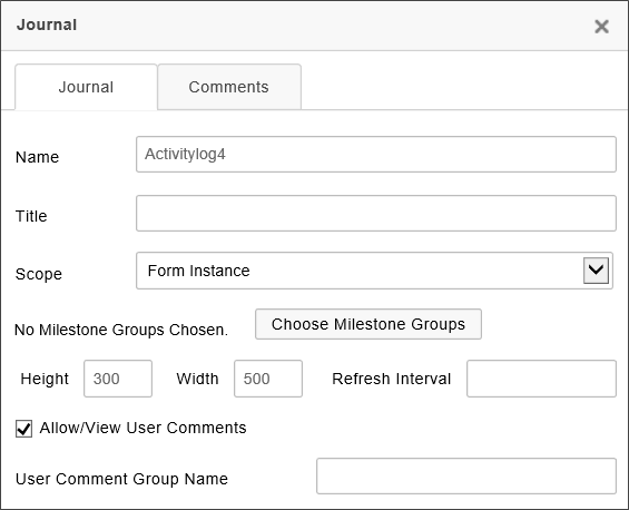
The following properties are available:
The Name property specifies the name of the control.
The Title property specifies the text that will appear in the title bar of the Journal control when it is displayed on the form at run time. If you leave this property blank, the default title will be "Journal".
The Scope property enables you to determine at what level to capture events. By default, the scope is limited to just Activity log events that are specified in the Form definition. You can change the scope to the following settings.
| SCOPE | DESCRIPTION |
|---|---|
| Limit to Case | Only show events from objects that are part of the current Case. |
| Limit to Form | Only show events that are specified in the current Form definition. |
| Limit to Process | Only show events from objects that are part of the current Process. |
| No Limit | Show any events from any object. This setting uses the widest possible scope, and will show any matching events. |
The Milestone Groups property enables you to optionally display selected Milestones, in addition to, or in lieu of, user comments. To select the Milestone Groups you'd like to display, click the Choose Milestone Groups button to open the Milestone chooser dialog, and select the desired Milestone Groups to display in the log.
The size of the control's appearance at run time is set using the Width and Height properties, both of which specify the size in pixels or percentages. As a best practice, you should set the Width to "100%" to fill the horizontal area of the viewport automatically, for accessibility purposes. The Height, on the other hand, should be set in Pixels, which will display the height of the control at a fixed size.
The Refresh Interval determines the amount of time, in seconds, between each time the log is refreshed. Leaving this property blank will ensure that the log doesn't refresh automatically.
The Allow/View User Comments is turned on by default, so that you can use the Journal as a comment log. Unchecking this property will disable user comments. For Process Director v5.26 and higher, the data entry text box on the Journal control is resizable at run-time, within its parent container, which won't resize.
The User Comment Group Name property enables you to specify a group with which to associate comments. Using this property, you can place multiple Journal controls on a case or a form and each Journal control can have its own user comments. For Process Director v6.1.300 and higher, this property supports the use of System Variables to specify the Comment Group name.
 Journal controls always have a value. The visual display of the Journal control is governed by internal HTML text, so even blank Journal controls have content, even though it's hidden HTML. Since this control always have a value, marking it as required will NOT force a user to make a Journal comment.
Video Example
In actual use on a form, the control will appear similar to this:
Other Control Tools
You can view the documentation for all tools available in the Online Form Designer by using the Table of Contents on the upper right corner of the page, or by clicking one of the links below.
Input Controls: Controls that are commonly used to collect data, but are a bit less widely used than the basic controls.
Other Input Controls: Additional Input controls, consisting mainly of the different content picker controls.
Actions: These controls enable you to control form actions, like placing buttons, or choosing objects via a picker,
Other Controls: Controls that perform miscellaneous tasks like adding HTML content, or labels.
Layout: Controls that are used to govern the control layout for the template, such as tabs and sections.
Responsive Layout: Controls that implement Bootstrap form layout objects.
Arrays: Controls that enable to you create and control arrays on the Form.
Attachments: Controls that enable you to add and show attachments, such as documents or images, to the Form.
Data List (v6.0.100 and higher): Controls that enable the display of tabular data on a Form.
Form Control Tags: System Variables used to add controls to a Form, instead of using the UI controls.
Documentation Feedback and Questions
If you notice some way that this document can be improved, we're happy to hear your suggestions. Similarly, if you can't find an answer you're looking for, ask it via feedback. Simply click on the button below to provide us with your feedback or ask a question. Please remember, though, that not every issue can be addressed through documentation. So, if you have a specific technical issue with Process Director, please open a support ticket.

