Related Topics
 Color Picker
This control was added in Process Director v6.1.500.
Selecting this menu item will place a Color Picker control on the Form. This control, at run-time, enables users to configure a specified color using a color chooser dropdown that appears as part of the control.
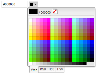
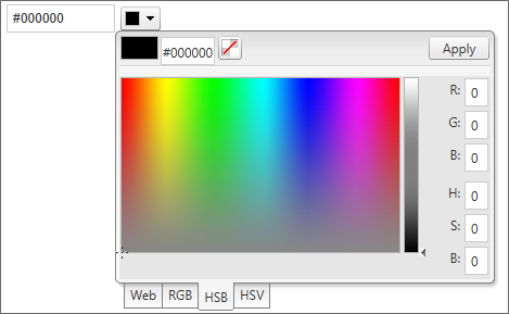
By default, Users can select HTML color swatches or enter an HTML hexadecimal color value. Additional options are also available to the user for using the RGB, HSB, and HSV color selection tools. Each color selection method has a unique color picker functionality. For example, this is the appearance of the HSB color picker:
Whichever method the user selects to pick a color will save the appropriate color to the control's built-in text box as an HTML hexadecimal color.
Other than the Name, there are two configurable properties for this control.
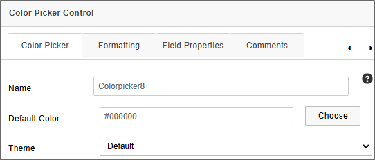
The Default Color property specifies the color that will be initially selected when the form runs, using color hexadecimal HTML syntax.
The Theme property is a dropdown that enables you to chose a visual style from several different options. The selected style will be applied to the control at run time.
Radio Button
 For Process Director v6.1.500, the Radio Button was replaced in the basic controls toolbar by the Radio Button List.
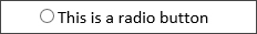
Selecting this menu item places a single Radio Button in the document where the cursor is located. You can add multiple radio buttons to the form.
The properties below are configurable from the Properties dialog box.
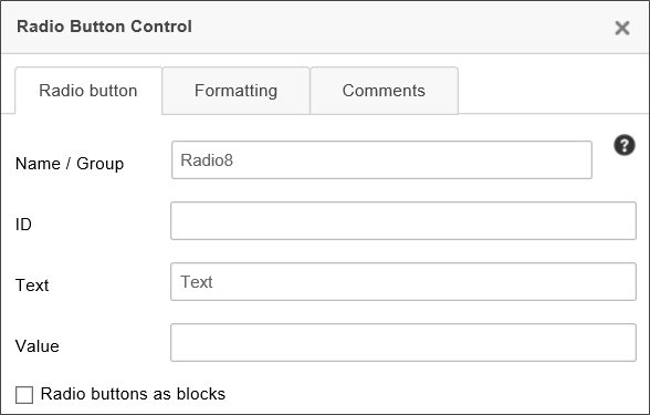
Name/Group: Each radio button you want added to the same group of controls should be given the same Name/Group value. To add multiple radio button groups, use different Name/Group value for each collection of radio buttons.
ID: For Accessibility reasons, Label controls must be associated with the Control ID of the control the Label is associated with. This property enables you to specify the ID of the Radio Button that can be used, in turn, as the Associated Control ID for the Label control.
Text: The text value that you want displayed on the Form.
Value: To specify a value for a radio button that is different than the text, enter the radio button’s value in the Value field.
Radio Buttons as Blocks: Checking this box will display all of the radio buttons included in the same group as a block.
The radio button input controls can be sized on the page by clicking and dragging the control to the desired size.
Radio Button controls are not list controls, and thus cannot be filled or created dynamically by associating them with a data source like a Business Value. To create radio buttons dynamically, please refer to the Radio Button List control.
Signature Comments
This field enables task participants to enter task comments when completing their tasks. Comments aren't required for task completion, by default.
Signature Comments have a major difference from other Form controls. They are not stored as Form data, and are thus not technically Form fields. Instead, comments placed in this control are saved as part of the Timeline Activity instance for which they are made. As such, they can't be displayed or retrieved via the use of Form System Variables. They can only be displayed via the Activity Users Complete system variable, using the format=comments modifier, e.g., {ACTIVITY_USERS_COMPLETE:ActivityName, format=comments}. Comments are also displayed in the Routing Slip for the Form, and in the Timeline Instance properties for the Timeline Instance.
Similarly, setting this control as required is performed on the Results tab of the Timeline Activity, and is set individually for each configured Activity Result. So, for a given Timeline Activity, signature comments may be required for one result, and not required for other results.
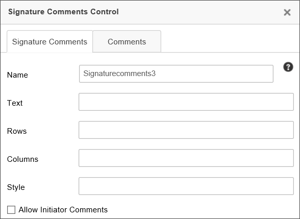
Text: The default text to display in the comments box.
Rows: Sets the height of the control.
Columns: Sets the width of the control.
Style: CSS Style commands to apply to the control.
Allow Initiator Comments: When checked the control will accept signature comments from the initiator/submitter.
In order to enable the initiator to enter comments, you must set the visibility properties for the control to display to the initiator by applying the visibility condition, "New Form Instance = True". By default, this control is hidden in new form instances.
Signature Control
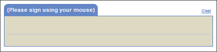
The Signature control enables the user to draw a signature on a Form using a mouse or stylus.
The ESIGN Act of 2000 guarantees that a signature stored via this control is legally binding:
[A] contract…can't be denied legal effect, validity, or enforceability solely because an electronic signature or electronic record was used in its formation. [ESIGN Act Section 106(2)]
The following properties are configurable:
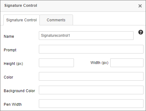
The Prompt property enables you to configure a prompt message displayed to the user prior to signing.
The Height and Width properties enable you change the size of the Signature control by specifying the size in pixels. The Signature control does, however, have a minimum size of 350x100 pixels, and it can't be sized smaller than the minimum size.
The Color property sets the color of the pen graphic, while the Background Color property sets that background color of the signature area.
Finally, the Pen Width property sets the thickness, in points, of the pen graphic's lines when drawing the signature with a mouse.
In the Form Definition's Form Controls tab, this control has Min and Max properties that you can use to specify the minimum and/or maximum size of the signature, measured in points, that are allowed for the signature field.
Process Director will disable the signature control after any save (including submission, save, and save and close). To change the default behavior, you can add a simple entry to the "Set Form Data" tab for the form that sets the signature control value to an empty string, with the condition that the control is empty on the display.
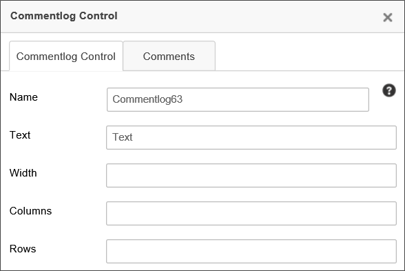
Comment Log
This control enables users to add text of any sort, which will be displayed to all subsequent users of the Form. The control displays every user comment and the time the comment was entered.
 This control is a legacy control which remains in the product primarily for backward compatibility purposes. The Journal control is the recommended control for collecting user comments, as it enables threaded comments, and supports other features, such as Milestones, that can't be replicated by the Comment Log.
In this control’s properties, you can configure the Comment Log’s group name, the control name, the default text, and the width of the log.
ListBox
This control is a multi-line list input control.
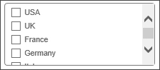
The ListBox control contains a list of checkboxes in a scrollable frame, where multiple checkboxes may or may not be selected.
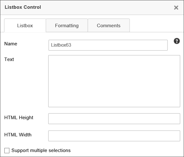
The following properties are configurable:
Name: The name of the control
Text: The values that will be displayed in the control. Like the Dropdown control, each line constitutes a different display item. Separate display strings and values can also be set, using the syntax DisplayString:Value. Just like the Dropdown control, setting the Text property is not recommended in most cases. The contents of a List Box should usually be set using a Dropdown Object or Business Value.
HTML Height/Width: The height and width of the control, using HTML measurements, e.g., "300px" or "20%".
Support Multiple Selections: When checked, enables users to select more than one item in the list. The value of the control will, if this property is enabled, be returned as a comma-separated list of values.
For Process Director v6.1.400, a new feature enables the use of a type-ahead to filter the available options in a List Box.
Slider
The Slider control allows you to select a numerical value using a slider.
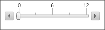
In the slider’s property window, you can configure its size, minimum and maximum values, and whether or not the handles and tick marks are displayed. The SmallChange property determines how much the value of the slider changes when the adjacent arrows are clicked, and the LargeChange property determines how much the value of the slider changes when a position on the slider is clicked.
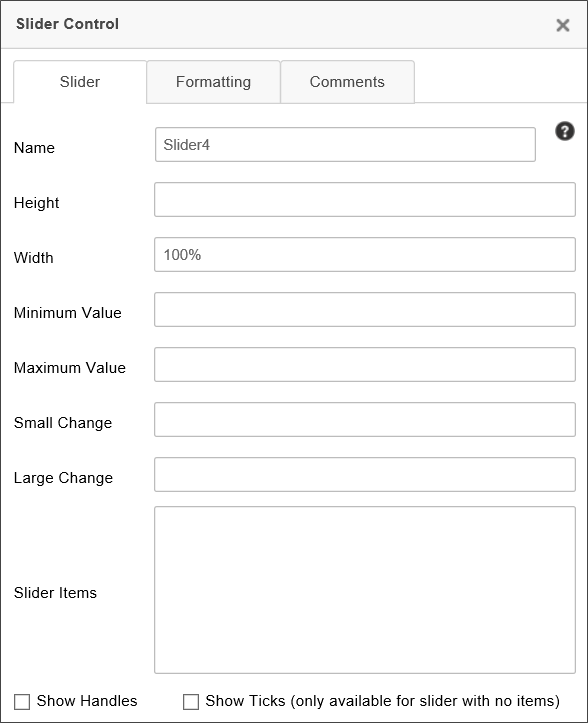
Remember that if you change the Width of the slider, using a percentage width, e.g., "100%" will cause the slider to size itself to the width of its containing object, such as a table cell. If the Slider is placed in a narrow table cell, then the slider may be much smaller than you expect. Using a pixel width, on the other hand, will set the Slider's width to a fixed width. If you don't set the Width, the Slider will appear with its default width, in pixels. So, it's probably best not to set the Width, unless you need the Slider to appear with a specific size, and then use a width in pixels, e.g., "250px" for the Width setting.
The Show Ticks property can't be used for Slider controls that use Slider Items.
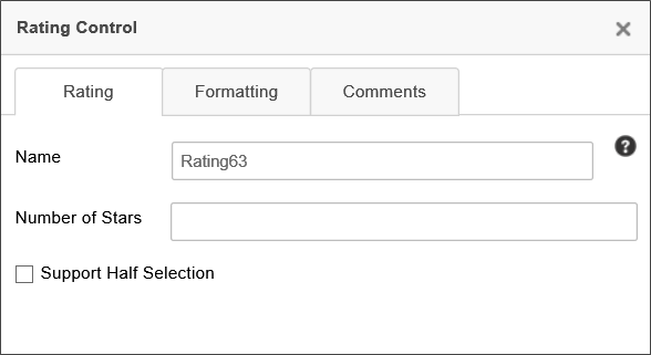
Rating
This control enables users to set a rating out of a possible number of stars.

The properties window for the control enables you to configure the Name of the rating control, the maximum Number of Stars, and, via the Support Half Selection property, whether the user can select half stars.
User Picker
This control enables the Form user to select Process Director users.
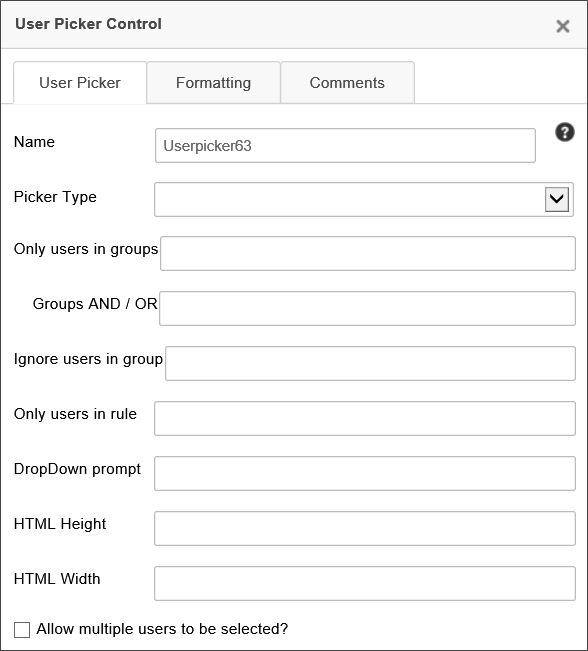
In most use cases, the User Picker requires that a user be logged into Process Director for the user picker to function correctly. A User Picker of the "Dropdown" type may function on anonymous Forms, but you should use caution when using it on Forms that can be accessed by anonymous users, as the control will reveal some user-related information, which you may not wish to expose publicly, for security reasons. Once a malicious actor can verify the UserID, name, or email of a system user, they might leverage that information for use in gaining unauthorized access to the system.
The User Picker’s properties enable you to configure filters for the users you wish to display, which will restrict the choices available to the user. The control can be displayed in the Form as a dropdowns, pop-up, etc., but by default, the control displays as a type-ahead dropdown. The default option is the recommended method of display. You can change the display by setting the desired option from the Picker Type property.
You can specify that only users in certain groups show up in the user picker by specifying a comma-separated list of groups in the Only users in groups property . If you type “AND” into the Groups AND / OR property, then only users belonging to all the specified groups will appear as options in the control. If you type “OR”, then users belonging to any of the specified groups will appear as options in the control.
The DropDown Prompt is the text that is shown before an option has been selected in the dropdown, e.g., “<Select User>”.
The control won't list users who are members of groups specified in the Ignore users in group property, if configured.
The control will only list users returned by the Business Rule specified in the Only users in rule property, if configured.
Setting Control Values
User Picker controls display the name of the user(s), but the actual value stored in the User Picker is the UID of the user, which is the GUID value that is used as the primary identifier for the user in Process Director. When setting the value of the User Picker via a Set Form Data action, you should use the UID to set the field value. For example, you can set the value of a user picker to the current user with the System Variable syntax:
{CURR_USER, format=UID}
For users of Process Director v5.31 and higher, you can also set the field's default value by using the UserID format. Previous versions require the UID to be set as the value. BP Logix still recommends the use of the UID format, however, since, on some systems, the UserID may not be a unique value, and may return an unexpected value.
The value of a User Picker can be set via system variable. For example, assuming that you configure each user profile to specify each user's manager in the system, you can set the value of a User Picker to the manager of the Form Submit User with the syntax:
{FORM_SUBMIT_USER, ShowManager=1, format=UID}
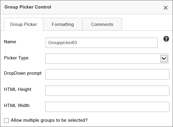
Group Picker
This control enables the Form user to select Process Director Groups.
In most use cases, the Group Picker requires that a user be logged into Process Director for the user picker to function correctly. A Group Picker of the "Dropdown" type may function on anonymous Forms, but you should use caution when using it on Forms that can be accessed by anonymous users, as the control will reveal some group-related information, which you may not wish to expose publicly, for security reasons.
Similar to the User Picker, the Group Picker can be displayed in the Form as a dropdown, pop-up, etc., via the Picker Type property, but the default—and preferred—setting is the type-ahead dropdown mode.
The DropDown Prompt is the text that is shown before an option has been selected in the dropdown, e.g., “<Select Group>”.
The HTML Height/Width properties set the height and width of the control, using HTML measurements, e.g., "300px" or "20%".
You can configure the Group Picker to enable the user to select multiple groups by clicking the Allow multiple groups to be selected? check box. When checked, this property will cause the control to return the selected values in a comma-separated list.
Other Control Tools
You can view the documentation for all tools available in the Online Form Designer by using the Table of Contents on the upper right corner of the page, or by clicking one of the links below.
Basic Controls: The most commonly-used form design tools.
Other Input Controls: Additional Input controls, consisting mainly of the different content picker controls.
Actions: These controls enable you to control form actions, like placing buttons, or choosing objects via a picker,
Other Controls: Controls that perform miscellaneous tasks like adding HTML content, or labels.
Layout: Controls that are used to govern the control layout for the template, such as tabs and sections.
Responsive Layout: Controls that implement Bootstrap form layout objects.
Arrays: Controls that enable to you create and control arrays on the Form.
Attachments: Controls that enable you to add and show attachments, such as documents or images, to the Form.
Data List (v6.0.100 and higher): Controls that enable the display of tabular data on a Form.
Form Control Tags: System Variables used to add controls to a Form, instead of using the UI controls.
Documentation Feedback and Questions
If you notice some way that this document can be improved, we're happy to hear your suggestions. Similarly, if you can't find an answer you're looking for, ask it via feedback. Simply click on the button below to provide us with your feedback or ask a question. Please remember, though, that not every issue can be addressed through documentation. So, if you have a specific technical issue with Process Director, please open a support ticket.


