Related Topics
Users of Process Director v5.35 and higher have a Responsive Layout menu in the Online Form Designer that implements Bootstrap integration with Process Director forms. Bootstrap is a free, open-source CSS framework used to create responsive, mobile-friendly layouts. Process Director integrates the CSS objects in Bootstrap as form controls that can be used to create responsive forms. Bootstrap automatically handles all the responsive features of the form and eliminates the need for you to implement custom CSS styles manually. Moreover, because Bootstrap is so widely used in general web design, the look and feel of your form, and its responsive operation, will be familiar to many users.
The drawback to this versatility is, of course, complexity, and the requirement that you be familiar with Bootstrap to use it to full advantage. And, while it does handle styling and responsiveness automatically, it does make implementing custom styles, should you choose to do so, more difficult, and requires more in-depth CSS knowledge to implement. As such, it may only be usable by designers with more advanced knowledge of web design.
You should weigh these pros and cons before deciding whether to use it.
The documentation on this page doesn't provide general information about how to implement Bootstrap based forms, but does provide information about the control properties available in the Process Director implementation. Otherwise, we assume that you already have the appropriate general Bootstrap knowledge required to use the available objects correctly. If you aren't familiar with the use of Bootstrap, we don't recommend using it to create production forms until you have the appropriate knowledge to do so.
If you'd like information about Bootstrap objects, and how they are implemented, please refer to the Bootstrap documentation at the Get Bootstrap web site.
 Use of the Responsive Layout controls requires that the fIncludeBootstrap custom variable be set to True. If this variable isn't set to True, the Responsive Layout controls menu won't appear in the UI of the Online Form Designer.
Control Settings
Unlike other controls, the Responsive Layout controls, when placed on a page, don't have Properties dialog boxes. Instead, editing the controls may require using the Source view of the designer to manually edit the HTML that is generated. Primarily, this is because the controls are responsive, so inserting a layout control on the page will include specific settings. For instance the container controls are the fundamental containers for all other Responsive Layout controls. The standard Container control automatically creates a container that is fixed-width, but changes at several breakpoints that depend on the size of the viewport. The Fluid Container control, on the other hand, is always set to 100% of the viewport. Since all other Responsive Layout controls are placed inside one of the container controls, the choice of container control will affect the width and layout of all other controls placed inside the container.
Also, keep in mind that the Responsive Layout controls are purely HTML/CSS entities. They aren't Process Director controls. You can't, therefore, assign visibility or enabling properties to the controls, in the same way that you can to a standard TabContent or Section layout control.
Responsive Layout Usage Tips
All forms created with the Responsive Layout controls must have a Container or Fluid Container as the base container for all other controls.
While there are many different controls in this group, The primary controls for creating forms should be the Container, Form Row, and Form Group controls. The Form Group control is especially useful in that it already provides a visual association between the label and data control, placing the label immediately above the data control automatically.
All of the Responsive Layout controls are just HTML DIV tags with specific CSS styling applied to them. In the Online Form Designer, some editing options are available by right-clicking inside the control's visual placeholder, and selecting Edit DIV Tag or Delete Div Tag from the popup menu.
In general, new controls are added at the bottom of the form. It is difficult, without directly editing the HTML source, to move objects to different locations on the form. It's best to set up the layout of the page first, before adding the controls, so you need to plan for how many controls and labels will be displayed, and how you want them to be laid out on the page. Once you've done so, you can then add the controls into their individual containers.
Some controls can't be added to parent controls, unless the parent control is relevant to the child control you are attempting to add. You can't, for instance, add a Form Group control directly to a Tab Content container, even though the Tab Content is a general container object. The Form Group is only relevant to the Form Row parent container, so you'd first need to insert a Form Row control into the Tab Content container, then add the Form Group inside the Form Row.
To insert a child control into a parent container, click inside the container, then select the appropriate child control from the menu. You can, once a parent container has been selected, insert multiple child containers in sequence.
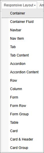
Available Layout Controls
 Container
This control is one of the base container controls that serve as the primary layout boundary for Bootstrap. This control is fixed-width at 1140px, with breakpoints at viewpoint widths of 960px, 720px, and 540px. With this control, the responsive views only appear when the screen width is resized to one of the break point widths.
Container Fluid
This control is one of the base container controls that serve as the primary layout boundary for Bootstrap. This control is relative-width at 100% of the viewport width. This control continuously resizes with the window.
Navbar
This control inserts a navigation bar with an included image location and three configurable navigation links.
Nav Item
This control inserts a navigation bar item element inside the navigation bar. It must be used inside a Navbar control.
Tab
This control inserts a Tab bar that contains two Tab Content controls.
Tab Content
This control, when a Tab control is selected, inserts an additional Tab Content control to the Tab.
Accordion
This control inserts an Accordion control that contains two Accordion Content controls.
Accordion Content
This control, when an Accordion control is selected, inserts an additional Accordion Content control to the Accordion .
Row
This control inserts a Row control inside of a container.
Column
This control inserts a Column control inside of a Row container. Bootstrap layouts allow up to 12 Columns in a Row.
Form
This control inserts a simple HTML FORM control. This control isn't usually needed for Process Director forms, though there are some use cases where a simple HTML form might be appropriate.
Form Row
This control is the basic row control that should be used for form layout. It can be placed in any parent container, and Form Group controls can subsequently be placed inside the Form Row control to automatically format form controls.
Form Group
This control is the basic control container that should be used for form layout. It can only be placed inside of a Form Row container. The Form Group should contain both a Label control and an input control, e.g., Input, Dropdown, etc. controls. The Form Group will automatically place the Label control immediately above, and aligned to the left side of, the input control.
Table
This control inserts an HTML table into a container. This is primarily designed for the display of tabular data, and not for layout, so it shouldn't be used as a form design element.
Card
This control inserts container that includes a configurable image placeholder, formatted title and content container. These containers can, unlike a standard Section control, be stacked horizontally, and will automatically refactor as the viewport width gets smaller, to display vertically, instead of horizontally.
Card and Header
This control inserts Card container that includes a header and content container. The Card and Header control can be inserted inside of an existing Card container. So you can have a parent card control with a title and content that contains a card and header control as additional related content.
Card Group
This control inserts container that includes three, horizontally-arrayed Card controls.
Other Control Tools
You can view the documentation for all tools available in the Online Form Designer by using the Table of Contents on the upper right corner of the page, or by clicking one of the links below.
Basic Controls: The most commonly-used form design tools.
Input Controls: Controls that are commonly used to collect data, but are a bit less widely used than the basic controls.
Other Input Controls: Additional Input controls, consisting mainly of the different content picker controls.
Actions: These controls enable you to control form actions, like placing buttons, or choosing objects via a picker,
Other Controls: Controls that perform miscellaneous tasks like adding HTML content, or labels.
Layout: Controls that are used to govern the control layout for the template, such as tabs and sections.
Arrays: Controls that enable to you create and control arrays on the Form.
Attachments: Controls that enable you to add and show attachments, such as documents or images, to the Form.
Data List (v6.0.100 and higher): Controls that enable the display of tabular data on a Form.
Form Control Tags: System Variables used to add controls to a Form, instead of using the UI controls.
Documentation Feedback and Questions
If you notice some way that this document can be improved, we're happy to hear your suggestions. Similarly, if you can't find an answer you're looking for, ask it via feedback. Simply click on the button below to provide us with your feedback or ask a question. Please remember, though, that not every issue can be addressed through documentation. So, if you have a specific technical issue with Process Director, please open a support ticket.


