Related Topics
The control toolbar enables you to add controls to the page design surface. The toolbar consists of seven tool icons that enables you to insert the most common controls onto the page, followed by a series of dropdown menus from which you can select lesser used controls.

To add a control to the page place the cursor on the page where you want the control to appear, then click on the control you wish to insert. The control will be placed in the desired location, after which you can configure the control's properties.
When a form field is added, it must contain a value in the Name field. Default names are used when fields are added (e.g. Input1, Input2); however, BP Logix recommends these default names be changed to a field name that is meaningful in the context of the form. If the Name property is empty, the field won't appear on the Form.
The Name property's value must meet the following conditions:
- The value must be unique, that is to say, used only once on the Form. If two fields use the same Name value, only one of the fields will be added to the Form definition, and an error will be displayed when the Form is opened.
- The value must be less than 64 characters in length.
- The value can't contain any spaces or most special characters. Only letters, numbers, dashes, and underscores are allowable.
While all controls have a Name property, the other properties for each control are very different, with each type of control having their own, unique sets of properties. To view detailed information about configuring the different controls that are available in the Online Form Designer, please see the Form Controls topic.
 For Process Director v5.25 and lower, the default text field on some controls was set to 'Text'. It now defaults to empty, to enable the use of null text with icons/images. This includes the Array Move Up/Down buttons, the Button control, the Cancel Process and Audit buttons.
Configuring Control Properties
Depending on the version of Process Director you're using, the method for configuring control properties will be different.
- For Process Director v6.0 and higher installations that use the Subscription license model for Process Director, control properties are displayed in the Design Console, a persistent Properties pane that appears on the right side of the design surface.
- For all earlier versions of Process Director, or installations that don't use the Subscription license, each control displays its own pop-up Properties dialog box.
These two methods of configuring control properties are discussed below.
Design Console (v6.0 and Higher)
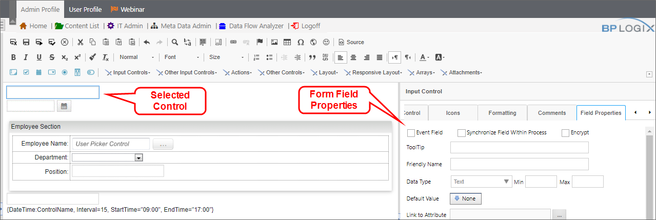
When a control is first inserted onto the Form's design surface, or when a Form control is selected by clicking it, a persistent properties pane called the Design Console will appear on the Form design surface will display all of the available properties for that control.
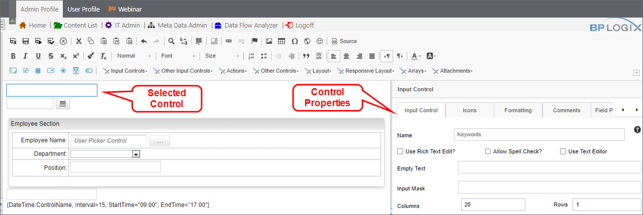
The control properties displayed in both the Design Console and the Properties dialog box in previous versions are exactly the same. For example, the Input control shown here will display the same Input Control, Icons, Formatting and Comments tabs.
In addition to that, the Design Console will, for appropriately licensed version of Process Director v6.0, display the Field Properties tab, which displays the field properties that were accessible only through the Form definition's Form Controls tab in previous versions. The ability to simultaneously configure both control and field properties significantly reduces the time needed for designing Forms.
Thus, the Design Console enables you to configure all of the relevant properties for that control, without having to switch between the Form's design view and Form Controls tab of the Form definition. The Form Controls tab will still be available in the Form definition, but the somewhat laborious process of switching back and forth while designing the Form will no longer be necessary.
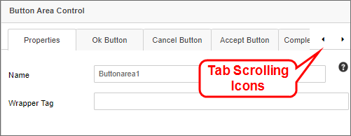
When placing controls on the Form's design surface, some controls, like the Button Area control, have a larger number of tabs than can be conveniently viewed in the Properties pane. Two scrolling icons on the right side of property tabs enable you to scroll horizontally, left or right, through the array of tabs to display the tab you need to view.
Selecting a form control on the design surface will automatically switch the Properties pane to display the properties for the selected control. Unlike the Properties dialog box in previous versions, there is no OK button to close and save the properties for each control. Property values are saved automatically with the form.
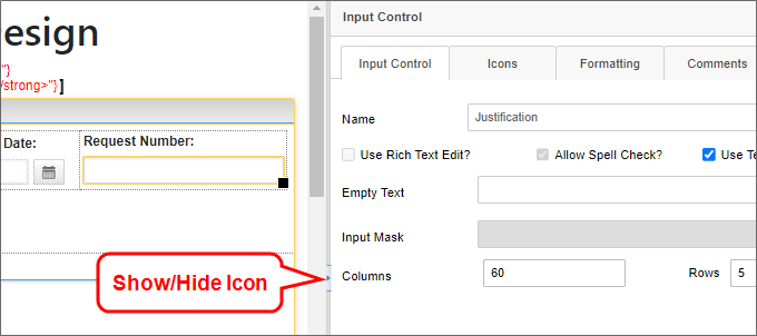
A small Show/Hide icon appears in the center of the divider bar between the Design Console and Form's design surface to enable you to close the pane to see your form in full-screen mode. This icon looks and works just like the icon that appears between the folder list and folder contents panes of the Content List.
When placing a control onto the Form's design surface, the properties for the control will be displayed automatically in the Design Console. You can view the properties for any other control by simply selecting it on the design surface, and the Design Console will display its properties automatically.
 Video Example
Properties Dialog Box
For all versions prior to Process Director v6.0, when a control is inserted on the Form's design surface, a pop-up dialog box will appear that enables you to configure the control's properties. Once you've done so, you can click the OK button to save the configuration and close the Properties dialog box.
You can re-open the Properties dialog box for any control by simply double-clicking the control whose properties you'd like to configure.
Control Tools
You can view the documentation for all of the Form control tools available in the Online Form Designer by using the Table of Contents on the upper right corner of the page, or by clicking one of the links below.
Form Controls: Overview of the available form controls.
Basic Controls: The most commonly-used form design tools.
Input Controls: Controls that are commonly used to collect data, but are a bit less widely used than the basic controls.
Other Input Controls: Additional Input controls, consisting mainly of the different content picker controls.
Actions: These controls enable you to control form actions, like placing buttons, or choosing objects via a picker,
Other Controls: Controls that perform miscellaneous tasks like adding HTML content, or labels.
Layout: Controls that are used to govern the control layout for the template, such as tabs and sections.
Responsive Layout: Controls that implement Bootstrap form layout objects.
Arrays: Controls that enable to you create and control arrays on the Form.
Attachments: Controls that enable you to add and show attachments, such as documents or images, to the Form.
Documentation Feedback and Questions
If you notice some way that this document can be improved, we're happy to hear your suggestions. Similarly, if you can't find an answer you're looking for, ask it via feedback. Simply click on the button below to provide us with your feedback or ask a question. Please remember, though, that not every issue can be addressed through documentation. So, if you have a specific technical issue with Process Director, please open a support ticket.


