Related Topics
The Dashboard object enables you to display a number of Widget objects as portlets in the Dashboard. Each type of widgets has a set of properties, some of which are specific to that widget. The various Widgets and their configurable properties, are described below.
Text #
The Text widget enables you to place arbitrary HTML-formatted text into a widget.
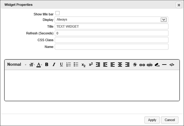
Unchecking this check box will hide the title bar for the widget on the Dashboard. The default value is Checked.
This dropdown enables you to choose when to display the widget. The default setting is "Always". The available options are:
- Always
- Desktop Only
- Mobile Only
This text box enables you to specify the title that appears on the widget's Title Bar.
This setting enables you to specify the number of second that can elapse before the widget refreshes automatically. The default setting is "0", which means the widget won't refresh.
If you are using a custom style sheet, you can specify a style name from that style sheet with this setting.
An object name that you can use to refer to the widget programmatically, or from other elements in the UI.
The bottom portion of the Widget Properties box contains a rich-text editor into which you can type and format the text you wish to display in the widget.
HTML #
This widget enables you to enter custom HTML to display in the widget.
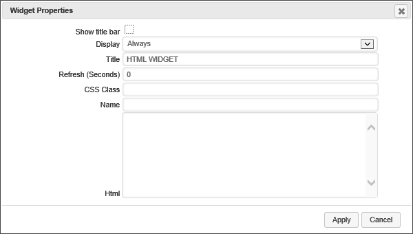
Unchecking this check box will hide the title bar for the widget on the Dashboard. The default value is Checked.
This dropdown enables you to choose when to display the widget. The default setting is "Always". The available options are:
- Always
- Desktop Only
- Mobile Only
This text box enables you to specify the title that appears on the widget's Title Bar.
This setting enables you to specify the number of second that can elapse before the widget refreshes automatically. The default setting is "0", which means the widget won't refresh.
If you are using a custom style sheet, you can specify a style name from that style sheet with this setting.
An object name that you can use to refer to the widget programmatically, or from other elements in the UI.
This textarea control accepts the raw HTML code that you wish to display.
URL #
This widget displays the web page that appears at the URL you specify.
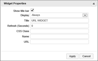
Unchecking this check box will hide the title bar for the widget on the Dashboard. The default value is Checked.
This dropdown enables you to choose when to display the widget. The default setting is "Always". The available options are:
- Always
- Desktop Only
- Mobile Only
This text box enables you to specify the title that appears on the widget's Title Bar.
This setting enables you to specify the number of second that can elapse before the widget refreshes automatically. The default setting is "0", which means the widget won't refresh.
If you are using a custom style sheet, you can specify a style name from that style sheet with this setting.
An object name that you can use to refer to the widget programmatically, or from other elements in the UI.
This is the page URL of the web page you wish to display.
Chart #
This widget will display a Process Director Chart object.

Unchecking this check box will hide the title bar for the widget on the Dashboard. The default value is Checked.
This dropdown enables you to choose when to display the widget. The default setting is "Always". The available options are:
- Always
- Desktop Only
- Mobile Only
This text box enables you to specify the title that appears on the widget's Title Bar.
This setting enables you to specify the number of second that can elapse before the widget refreshes automatically. The default setting is "0", which means the widget won't refresh.
If you are using a custom style sheet, you can specify a style name from that style sheet with this setting.
An object name that you can use to refer to the widget programmatically, or from other elements in the UI.
An object picker that enables you to select the Chart that you wish to display.
KView #
This widget will display a Process Director Knowledge View object.

Unchecking this check box will hide the title bar for the widget on the Dashboard. The default value is Checked.
This dropdown enables you to choose when to display the widget. The default setting is "Always". The available options are:
- Always
- Desktop Only
- Mobile Only
This text box enables you to specify the title that appears on the widget's Title Bar.
This setting enables you to specify the number of second that can elapse before the widget refreshes automatically. The default setting is "0", which means the widget won't refresh.
If you are using a custom style sheet, you can specify a style name from that style sheet with this setting.
An object name that you can use to refer to the widget programmatically, or from other elements in the UI.
An object picker that enables you to select the Knowledge View that you wish to display.
Global KView #
This widget will display a Process Director Global Knowledge View object.
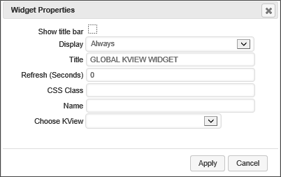
Unchecking this check box will hide the title bar for the widget on the Dashboard. The default value is Checked.
This dropdown enables you to choose when to display the widget. The default setting is "Always". The available options are:
- Always
- Desktop Only
- Mobile Only
This text box enables you to specify the title that appears on the widget's Title Bar.
This setting enables you to specify the number of second that can elapse before the widget refreshes automatically. The default setting is "0", which means the widget won't refresh.
If you are using a custom style sheet, you can specify a style name from that style sheet with this setting.
An object name that you can use to refer to the widget programmatically, or from other elements in the UI.
An object picker that enables you to select the Global Knowledge View that you wish to display.
Form #
This widget will display a Process Director Form as a new form instance.
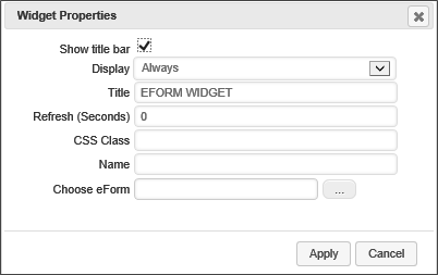
Unchecking this check box will hide the title bar for the widget on the Dashboard. The default value is Checked.
This dropdown enables you to choose when to display the widget. The default setting is "Always". The available options are:
- Always
- Desktop Only
- Mobile Only
This text box enables you to specify the title that appears on the widget's Title Bar.
This setting enables you to specify the number of second that can elapse before the widget refreshes automatically. The default setting is "0", which means the widget won't refresh.
If you are using a custom style sheet, you can specify a style name from that style sheet with this setting.
An object name that you can use to refer to the widget programmatically, or from other elements in the UI.
An object picker that enables you to select the Form that you wish to display.
Form Instance #
This widget will display the most recent form instance of a selected Form Definition.
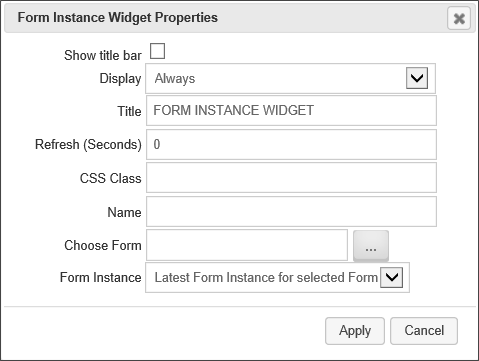
Unchecking this check box will hide the title bar for the widget on the Dashboard. The default value is Checked.
This dropdown enables you to choose when to display the widget. The default setting is "Always". The available options are:
- Always
- Desktop Only
- Mobile Only
This text box enables you to specify the title that appears on the widget's Title Bar.
This setting enables you to specify the number of second that can elapse before the widget refreshes automatically. The default setting is "0", which means the widget won't refresh.
If you are using a custom style sheet, you can specify a style name from that style sheet with this setting.
An object name that you can use to refer to the widget programmatically, or from other elements in the UI.
An object picker that enables you to select the Form definition for which you wish to display the most recent form instance.
A dropdown that enables you to select either the latest Form instance of the selected form, or the Form instance that initiated the current Case instance, when used in a Case dashboard.
Report #
This widget will display a selected Process Director Report.

Unchecking this check box will hide the title bar for the widget on the Dashboard. The default value is Checked.
This dropdown enables you to choose when to display the widget. The default setting is "Always". The available options are:
- Always
- Desktop Only
- Mobile Only
This text box enables you to specify the title that appears on the widget's Title Bar.
This setting enables you to specify the number of second that can elapse before the widget refreshes automatically. The default setting is "0", which means the widget won't refresh.
If you are using a custom style sheet, you can specify a style name from that style sheet with this setting.
An object name that you can use to refer to the widget programmatically, or from other elements in the UI.
An object picker that enables you to select the Report object that you wish to display.
Document #
This widget enables you to display a document from the Content List.
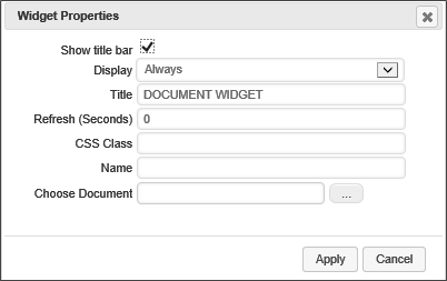
Unchecking this check box will hide the title bar for the widget on the Dashboard. The default value is Checked.
This dropdown enables you to choose when to display the widget. The default setting is "Always". The available options are:
- Always
- Desktop Only
- Mobile Only
This text box enables you to specify the title that appears on the widget's Title Bar.
This setting enables you to specify the number of second that can elapse before the widget refreshes automatically. The default setting is "0", which means the widget won't refresh.
If you are using a custom style sheet, you can specify a style name from that style sheet with this setting.
An object name that you can use to refer to the widget programmatically, or from other elements in the UI.
An object picker that enables you to select the Document object that you wish to display.
Image #
This widget enables you to display an image from a URL, or that is contained in the Content List.
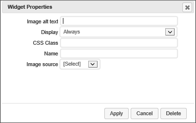
The text that should be placed in the ALT attribute of the HTML IMG tag that will be used to display the image.
This dropdown enables you to choose when to display the widget. The default setting is "Always". The available options are:
- Always
- Desktop Only
- Mobile Only
If you are using a custom style sheet, you can specify a style name from that style sheet with this setting.
An object name that you can use to refer to the widget programmatically, or from other elements in the UI.
This dropdown enables you to set the source of the image to display. The following options are available:
- URL: If this option is selected, Process Director will display a URL text box, into which you can input the fully-qualified URL of the image.
- Document: If this option is selected Process Director will display a Choose Document object picker from which you can choose an image stored in the Content List.
Button #
This Widget will display a configurable button on the dashboard.
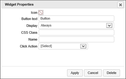
This icon chooser, when clicked, will display the Icon Chooser window to enable you to select the icon that should appear on the button.
This property specifies the text that will appear on the button.
This dropdown enables you to choose when to display the widget. The default setting is "Always". The available options are:
- Always
- Desktop Only
- Mobile Only
If you are using a custom style sheet, you can specify a style name from that style sheet with this setting.
An object name that you can use to refer to the widget programmatically, or from other elements in the UI.
This dropdown enables you to select the action that Process Director will take when the button is clicked by a user. You can select a URL or Content List object to open. When you select an object, the appropriate controls will appear to enable you to specify the object you wish to display, e.g., a content picker for a Content List object, or a text box for a URL. Alternatively, you can set the button to log off the user, or to close the case workspace, if the dashboard is being used in the context of a case.
If you select an object to open, it will, by default, be displayed in an overlay panel to the dashboard when the button is clicked. Checking this checkbox, however, will make Process Director open the object in a separate popup window.
Clock #
This widget will display an analog clock, with a sweep second hand, and configurable text that displays in the bottom portion of the clock face.
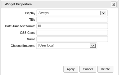
This dropdown enables you to choose when to display the widget. The default setting is "Always". The available options are:
- Always
- Desktop Only
- Mobile Only
This text box enables you to specify the title that appears on the widget's Title Bar.
This setting enables you to enter a format string to specify the date or time information you wish to display in the clock face's text area. There are a large number of format strings that can be used, as shown below. The default format string is "llll".
Localized Time/Date Formats
| Format Type | Format String | Output |
|---|---|---|
| Time | LT
|
8:30 PM |
| Time with seconds | LTS
|
8:30:25 PM |
| Month numeral, day of month, year |
|
09/04/1986 9/4/1986 |
| Month name, day of month, year |
|
September 4 1986 Sep 4 1986 |
| Month name, day of month, year, time |
|
September 4 1986 8:30 PM Sep 4 1986 8:30 PM |
| Month name, day of month, day of week, year, time |
|
Thursday, September 4 1986 8:30 PM Thu, Sep 4 1986 8:30 PM |
Advanced Formatting
| Format Type | Format String | Output |
|---|---|---|
| Month |
|
1 2 ... 11 12 1 st 2nd ... 11th 12th 01 02 ... 11 12 Jan Feb ... Nov Dec January February ... November December |
| Quarter |
|
1 2 3 4 1st 2nd 3rd 4th |
| Day of Month |
|
1 2 ... 30 31 1st 2nd ... 30th 31st 01 02 ... 30 31 |
| Day of Year |
|
1 2 ... 364 365 1st 2nd ... 364th 365th 001 002 ... 364 365 |
| Day of Week |
|
0 1 ... 5 6 0th 1st ... 5th 6th Su Mo ... Fr Sa Sun Mon ... Fri Sat Sunday Monday ... Friday Saturday |
| Day of Week (Locale) | e
|
0 1 ... 5 6 |
| Day of Week (ISO) | E
|
1 2 ... 6 7 |
| Week of Year |
|
1 2 ... 52 53 1st 2nd ... 52nd 53rd 01 02 ... 52 53 |
| Week of Year (ISO) |
|
1 2 ... 52 53 1st 2nd ... 52nd 53rd 01 02 ... 52 53 |
| Year |
|
70 71 ... 29 30 1970 1971 ... 2029 2030 1970 1971 ... 9999 +10000 +10001
|
| Week Year |
|
70 71 ... 29 30 1970 1971 ... 2029 2030 |
| Week Year (ISO) |
|
70 71 ... 29 30 1970 1971 ... 2029 2030 |
| AM/PM |
|
AM PM am pm |
| Hour |
|
0 1 ... 22 23 00 01 ... 22 23 1 2 ... 11 12 01 02 ... 11 12 1 2 ... 23 24 01 02 ... 23 24 |
| Minute |
|
0 1 ... 58 59 00 01 ... 58 59 |
| Second |
|
0 1 ... 58 59 00 01 ... 58 59 |
| Fractional Second |
|
0 1 ... 8 9 00 01 ... 98 99 000 001 ... 998 999 |
| Time zone |
|
EST CST ... MST PST -07:00 -06:00 ... +06:00 +07:00 -0700 -0600 ... +0600 +0700 |
| Unix Timestamp | X
|
1360013296 |
| Unix Millisecond Timestamp | x
|
1360013296123 |
If you are using a custom style sheet, you can specify a style name from that style sheet with this setting.
An object name that you can use to refer to the widget programmatically, or from other elements in the UI.
This dropdown list contains the timezone settings for a large number of world locations, as well as User local time, UTC, and Zulu time. The default setting for this property is User Local time.
Activity Journal #
For Process Director v5.0 and higher, the Activity journal enables you to display Milestones and threaded discussions in a Dashboard.
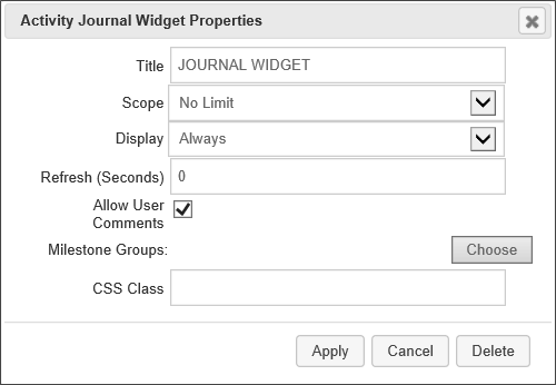
The Journal widget has the following configuration options available:
The title you desire to display in the title bar of the dashboard widget.
The Scope property enables you to determine at what level to capture events. By default, the scope is limited to just Activity log events that are specified in the Form definition. You can change the scope to the following settings:
| SCOPE | DESCRIPTION |
|---|---|
| Limit to Case | Only show events from objects that are part of the current Case. |
| No Limit | Show any events from any object. This setting uses the widest possible scope, and will show any matching events. |
This dropdown enables you to choose when to display the widget. The default setting is "Always". The available options are:
- Always
- Desktop Only
- Mobile Only
This dropdown enables you to choose when to display the widget. The default setting is "Always". The available options are:
- Always
- Desktop Only
- Mobile Only
Checking this property will enable users to participate in threaded discussions in the Journal widget.
The Milestone Groups property enables you to optionally display selected Milestones, in addition to, or in lieu of, user comments. To select the Milestone Groups s you'd like to display, click the Choose Milestone Groups button to open the Milestone chooser dialog, and select the desired Milestone Groups to display.
If you are using a custom style sheet, you can specify a style name from that style sheet with this setting.
Documentation Feedback and Questions
If you notice some way that this document can be improved, we're happy to hear your suggestions. Similarly, if you can't find an answer you're looking for, ask it via feedback. Simply click on the button below to provide us with your feedback or ask a question. Please remember, though, that not every issue can be addressed through documentation. So, if you have a specific technical issue with Process Director, please open a support ticket.
 This formatting complies with the ISO 8601 standard for dates past the year 9999

