Related Topics
This principle relates to making information and user interface components presentable to users in ways they can perceive.
Guideline 1.1 – Text Alternatives
Provide text alternatives for any non-text content so that it can be changed into other forms people need, such as large print, braille, speech, symbols or simpler language.
1.1.1 Non-text Content
Level A - All non-text content that is presented to the user has a text alternative that serves the equivalent purpose.
In the context of a Process Director form or Dashboard, this requirement is primarily applicable to the use of images, including logos and other branding images. Image controls in Process Director's Online Form Designer contain an Alternative Text property. This property should be used to provide descriptive text for all images you display on forms.
Similarly, Button controls have an Alt Text property that you should use to provide descriptive text to buttons that only present images or icons.
All data entry controls should have a Label control associated with them. In the properties dialog of the Label control, the Associated Control ID property should contain the Name of the control to which the Label is associated. For instance, if you have an Input control with the Name "FirstName", the Associated Control ID of the Label would be "FirstName". Label controls also have an Alt Tag property to provide the required text alternative to the Text property of the Label. When using tables, the Label control should be placed in the same table cell as the data entry control to which it is associated, to make it easier for assistive devices to understand the relationship between the two controls on the page.
Tables have a Caption property to provide text-based table descriptions in the Table Properties dialog box. Additionally, a Summary property provides a text representation of the table's purpose or brief description of the data it contains.
Guideline 1.2 – Time-based Media
Provide alternatives for time-based media.
This isn't generally relevant to Process Director, as forms don't display video or audio presentations.
Guideline 1.3 – Adaptable
Create content that can be presented in different ways (for example simpler layout) without losing information or structure.
1.3.1 Info and Relationships
Level A - Information, structure, and relationships conveyed through presentation can be programmatically determined or are available in text.
You should use tables to present tabular data, and use the appropriate table headers. When doing so, Process Director's Online Form Designer will automatically insert the appropriate table, th, tr, td, etc., tags. You can specify the headers as the first row, first column, or both, using the Headers property of the Table's properties Dialog. Additionally, the Cell Properties dialog box has a Cell Type property you can use to specify if a table is a data or header cell.
Process Director automatically provides the HTML "scope" attribute for headers to associate header cells and data cells in data tables.
1.3.2 Meaningful Sequence
Level A - When the sequence in which content is presented affects its meaning, a correct reading sequence can be programmatically determined.
This isn't generally relevant to Process Director.
1.3.3 Sensory Characteristics
Level A - Instructions provided for understanding and operating content don't rely solely on sensory characteristics of components such as shape, color, size, visual location, orientation, or sound.
You should always provide textual identification of items that otherwise rely only on sensory information to be understood. In other words, image-only buttons, images used as buttons, or other UI conventions should always provide a textual identification in addition to the sensory-based convention, e.g., using explicit text labels for buttons, in addition to images or icons, where possible. There are exceptions when space constraints may not allow the use of such explicit text, in which case you must use the Alt Text property of the object to ensure a text alternative is always available for it.
1.3.4 Orientation
Level AA - Content doesn't restrict its view and operation to a single display orientation, such as portrait or landscape, unless a specific display orientation is essential.
As a best practice, you shouldn't fix widths for layout elements if doing so isn't essential. By default, for example, the default width of tables in the Online Form Designer is 100%, which enables them to scale to the screen width of the viewport. You shouldn't impose a specific screen size or viewport on your users, or attempt to replicate the exact layout of a printed form. Users who require a larger font, for example, may find such forms more difficult to read or use because of the layout restrictions you've imposed.
1.3.5 Identify Input Purpose
Level AA - The purpose of each input field collecting information about the user can be programmatically determined
As a best practice, all input fields should have logical, recognizable Name properties that reflect the type of data being collected by the input control, rather than use among conventions that make sense only to developers or other IT personnel. For instance, "FirstName" tells you fairly specifically what the purpose of the input control is, while "frm11a_txt_fname" is substantially more opaque.
Guideline 1.4 – Distinguishable
Make it easier for users to see and hear content including separating foreground from background.
1.4.1 Use of Color
Level A - Color isn't used as the only visual means of conveying information, indicating an action, prompting a response, or distinguishing a visual element.
As a best practice, any information conveyed by color differences should also be available in text. Use of color cues alone to display a status, or prompt a response isn't an acceptable accessibility practice. Color should be an enhancement to, and not the primary method of, communication.
1.4.2 Audio Control
Level A - If any audio on a Web page plays automatically for more than 3 seconds, either a mechanism is available to pause or stop the audio, or a mechanism is available to control audio volume independently from the overall system volume level.
This is generally not relevant to Process Director.
1.4.3 Contrast (Minimum)
Level AA - The visual presentation of text and images of text has a contrast ratio of at least 4.5:1, except the following:
Large Text: Large-scale text and images of large-scale text have a contrast ratio of at least 3:1;
Incidental: Text or images of text that are part of an inactive user interface component, that are pure decoration, that aren't visible to anyone, or that are part of a picture that contains significant other visual content, have no contrast requirement.
Logotypes: Text that is part of a logo or brand name has no contrast requirement.
As a best practice, text should be easily distinguishable from any background colors or images through the use of highly contrasting colors. Without sufficient contrast such text will be difficult for to read by users who are visually impaired. The WCAG specification links to a number of web-based tools that are available online for analyzing color contrasts to ensure that your design meets the required contrast ratios. In addition, we've provided a set of sample colors you might want to consider for creating the appropriate contrasts with white or black text, for use with UI elements like buttons.
1.4.4 Resize text
Level AA - Except for captions and images of text, text can be resized without assistive technology up to 200 percent without loss of content or functionality.
Most modern web browsers have 200%+ text resizing built in. As a form designer, you should remember that the text size in which you are designing the form may not be the size in which your users are viewing it. As a best practice, you should view your form at different text sizes, up to 200%, to ensure that the layout and usability of your form remains intact at high zoom levels. This also relates to the best practice identified for WCAG specification 1.3.4, above, as this requirement affect the proposed layout of your form at high magnifications.
1.4.5 Images of Text
Level AA - If the technologies being used can achieve the visual presentation, text is used to convey information rather than images of text except for the following:
Customizable: The image of text can be visually customized to the user's requirements;
Essential: A particular presentation of text is essential to the information being conveyed.
Note 1: Logotypes (text that is part of a logo or brand name) are considered essential.
As a best practice, use text, rather than images of text, wherever possible.
1.4.10 Reflow
Level AA - Content can be presented without loss of information or functionality, and without requiring scrolling in two dimensions.
Though there are some minor exceptions to this requirement in the WCAG 1.4.10 standard in general, you should ensure that your users don't have to scroll in more than one dimension, i.e., vertical scrolling alone is acceptable, as is horizontal scrolling alone, but requiring users to scroll both vertically and horizontally isn't acceptable. (As a best practice, horizontal scrolling should be eliminated entirely if it is possible to do so.)
When using installations with the mobile device component, Process Director will automatically reflow content, such as tables, to ensure it fits within smaller viewports without having to scroll horizontally. Otherwise, some relatively simple CSS styling applied to the form in the Properties tab of the Form Definition can accomplish the same refactoring to control the reflow of a table. A sample of this sort of reflow CSS is provided below.
 Code Sample
@media
only screen and (max-width: 860px),
(min-device-width: 860px) and (max-device-width: 1024px) {
/* Force table to not be like tables anymore */
table, thead, tbody, th, td, tr {
display: block;
}
/* Hide table headers (but not display: none;, for accessibility) */
thead tr {
position: absolute;
top: -9999px;
left: -9999px;
}
tr {
border-top: 1px solid #eeeeee;
margin-top:10px;
}
}
For many UI elements, such as tables, or controls like the Section control, Process Director sets the default Width of the element to 100% of screen width automatically. In most use cases, this ensures that the element fills the screen horizontally, but doesn't extend beyond the screen's width. Images, however, can be particularly troublesome in this regard, since an image that displays well on a desktop screen may be too wide to display properly on a table or phone. These large images will push the effective screen width beyond the horizontal size of the screen, which will also force the vertical size of other elements off the edge of the screen. You may wish to set the CSS style for images (i.e., the img element, to a max-width of 100% to ensure that, as screen widths change, the image never extends beyond the screen's width. This CSS style forces the width of the element to always be no larger than 100% of screen width, and enforces this setting by forcing the image to resize to the screen width when the screen is resized. This style can easily be applied in the Image control's properties by adding this style setting to the image in the Style property.
For the standard Image control, the Style property can be found on the Advanced tab of the Properties dialog box for the control.

For the BP Logix-specific Image control that's accessed via the Other Controls menu, the Style property is displayed on the Image Control tab of it's Properties dialog box.

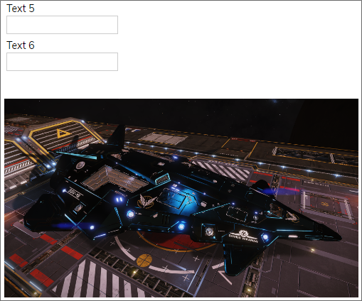
Once set, the image will always display properly, as shown in the examples below.
Image Example
Wide Screens:

Narrow Screens:
1.4.11 Non-text Contrast
Level AA - The visual presentation of the following have a contrast ratio of at least 3:1 against adjacent color(s):
User Interface Components: Visual information required to identify user interface components and states, except for inactive components or where the appearance of the component is determined by the user agent and not modified by the author;
Graphical Objects: Parts of graphics required to understand the content, except when a particular presentation of graphics is essential to the information being conveyed.
As a best practice, and as with the text contrast requirements of 1.4.3, above, user interface components and other graphical object must have a relatively high contrast. For example, a button with blue text and a slightly darker blue background might look nice, but will probably not have enough contrast between the button's background color and text to meet the requirements of this specification. In Process Director, button background, text, and icon colors can all be specified b the designer, so ensure that the color contrasts are large enough for visually impaired users to easily differentiate between them. Again refer to the contrast analyzer tools linked in 1.4.3, above.
1.4.12 Text Spacing
Level AA - In content implemented using markup languages that support the following text style properties, no loss of content or functionality occurs by setting all of the following and by changing no other style property:
Line height (line spacing) to at least 1.5 times the font size;
Spacing following paragraphs to at least 2 times the font size;
Letter spacing (tracking) to at least 0.12 times the font size;
Word spacing to at least 0.16 times the font size.
Exception: Human languages and scripts that don't make use of one or more of these text style properties in written text can conform using only the properties that exist for that combination of language and script.
Though this is generally not relevant to Process Director, you should, as a best practice, not make the organization or presentation of information dependent on line, letter, or paragraph spacing. This is also a layout consideration that affects the requirements of both 1.3.4, and 1.4.4, above.
1.4.13 Content on Hover or Focus
Level AA - Where receiving and then removing pointer hover or keyboard focus triggers additional content to become visible and then hidden, the following are true:
Dismissible: A mechanism is available to dismiss the additional content without moving pointer hover or keyboard focus, unless the additional content communicates an input error or doesn't obscure or replace other content;
Hoverable: If pointer hover can trigger the additional content, then the pointer can be moved over the additional content without the additional content disappearing;
Persistent: The additional content remains visible until the hover or focus trigger is removed, the user dismisses it, or its information is no longer valid.
Exception: The visual presentation of the additional content is controlled by the user agent and isn't modified by the author.
While not generally relevant to Process Director in the specific context of a mouseover or hover action, there are times when you want information to appear or disappear based on the value of some evaluable condition, or when you select a control. Process Director provides both Section and Embedded Section controls that enable you to hide or reveal form areas. When shown, these sections are persistent until the condition changes or it is hidden manually. Also, this hiding or displaying of information is generally done via events other than mouseover, in order to provide both persistence, and user-level manual control over when the information is hidden or displayed. As a general rule, attempting to show or hide information based on the position of the mouse isn't a good practice.
Other Accessibility Principles
Principle 2 - Operable: This principle relates to how user interface components and navigation operate.
Principle 3 - Understandable: This principle relates to making information and the operation of the user interface understandable to users.
Principle 4 - Robust: This principle relates to making content robust enough to be interpreted by a wide variety of user agents, including assistive technologies.
Documentation Feedback and Questions
If you notice some way that this document can be improved, we're happy to hear your suggestions. Similarly, if you can't find an answer you're looking for, ask it via feedback. Simply click on the button below to provide us with your feedback or ask a question. Please remember, though, that not every issue can be addressed through documentation. So, if you have a specific technical issue with Process Director, please open a support ticket.


